What Your Closet Doesn't Know About the Camera
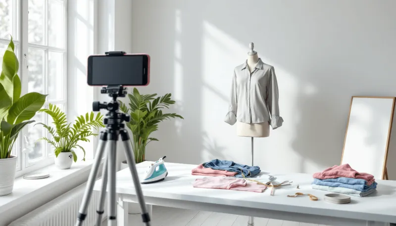
Photo: professional wardrobe styling flat lay clothing selection portrait photography studio, via cdn.prod.website-files.com
There is a particular confidence that arrives when you put on your favorite outfit. The fit feels right. The color seems to brighten your complexion. The fabric moves the way you want it to. You look in the mirror and something clicks. That sensation is real, and it is also, from a photographic standpoint, almost entirely irrelevant.
The camera does not feel what you feel. It does not register the softness of a well-worn linen blazer or the way a particular shade of burgundy makes your eyes come alive in afternoon light. What it captures instead is a flat, two-dimensional translation of light bouncing off surfaces — and that translation operates by rules that have very little to do with how clothing behaves in the natural world.
Understanding those rules is not a matter of abandoning personal style. It is a matter of learning to dress for two audiences simultaneously: the room you walk into every day, and the lens that will define how others see you long after the session ends.
Why Texture Reads Differently Under Studio Light
Fabric texture is one of the most common sources of disappointment in portrait photography. Clothing that appears richly dimensional in person — a herringbone tweed, a chunky knit, a textured linen — can photograph in one of two equally unflattering ways. Under harsh directional light, the weave pattern becomes visually dominant, drawing the eye away from your face and toward your torso. Under diffused studio light, that same texture may flatten entirely, leaving the garment looking shapeless and dull.
Professional stylists approach texture not as an aesthetic preference but as a technical variable. They consider how a fabric's surface will interact with the specific lighting setup being used, and they frequently choose mid-weight wovens and matte finishes that hold their visual character across a range of lighting conditions without overwhelming the composition. The goal is always to keep the viewer's attention where it belongs: on the face.
Sheen is an equally important consideration. Satin, certain silks, and polyester blends that look elegant under ambient light can become reflective under studio strobes, creating hot spots — areas of concentrated brightness — that distort the garment's apparent shape and compete visually with skin tone. This is why many professional stylists reach for matte-finish fabrics even when the occasion calls for something more formal.
The Color Saturation Problem
Color behaves differently on camera than it does to the naked eye, and this discrepancy is more significant than most people anticipate. The human visual system is remarkably adaptive; it adjusts continuously to shifts in ambient light, compensating for color casts and maintaining a relatively stable perception of hue. Camera sensors do not adapt in the same way. They record what is mathematically present in the light, which means that colors can shift, saturate, or desaturate in ways that feel surprising when you see the final image.
Bright reds and oranges are particularly prone to what photographers call "blowing out" — losing detail and appearing as flat, aggressive patches of color rather than nuanced fabric. Neons and highly saturated jewel tones can cast color onto the skin, subtly altering complexion in ways that are difficult to correct in post-processing. Even white, the most seemingly neutral choice, can be problematic; a stark white shirt under studio flash may read as so bright that it throws the exposure balance off, causing the face to appear darker by comparison.
The palette that tends to perform most reliably in portrait settings consists of what stylists often refer to as "camera-friendly" tones: muted mid-range colors, dusty blues, warm grays, soft olives, and deep navies. These hues hold their integrity under varied lighting conditions and complement a wide range of skin tones without competing with the subject's face.
Silhouette and the Two-Dimensional Body
When you stand in front of a mirror, your brain constructs a three-dimensional understanding of your body. You perceive depth, volume, and proportion in a way that is continuous and dynamic. A photograph collapses all of that into a single plane, and silhouette becomes the primary vehicle for conveying shape.
This is where many wardrobe choices go wrong. Oversized garments that feel relaxed and intentional in person can photograph as formless, obscuring the body's natural line and making the subject appear larger or less defined than they are. Conversely, very fitted garments may emphasize proportions in ways that feel unfamiliar when seen in a still image, because the eye has no movement or context to soften the reading.
Professional stylists typically favor what might be called "structured ease" — garments that have clear shape and defined shoulders without being tight, that suggest the body's form without mapping it precisely. A well-cut blazer, for instance, performs reliably across a wide range of body types and portrait contexts because it provides visual structure while allowing natural movement.
Pattern presents a related challenge. Small, repetitive patterns — fine stripes, micro-checks, intricate prints — can produce a visual vibration effect on camera known as moiré, a distracting interference pattern that has nothing to do with how the garment looks in person. Larger, bolder patterns may read clearly but can dominate the frame. Solid colors or very subtle textures typically allow the photographer the most compositional control.
Dressing for the Portrait You Actually Want
None of this means that your portrait session wardrobe needs to feel impersonal or disconnected from your authentic style. The most effective approach is to treat your everyday wardrobe as a starting point and then make deliberate refinements based on how specific garments are likely to behave on camera.
Before your session, consider photographing your outfit options at home using your phone, in a variety of lighting conditions. This simple exercise will reveal more than any amount of mirror-gazing. Pay attention to how colors shift, how textures read, and how the silhouette holds up when the image is viewed on a screen rather than in person.
Bring options to the session itself. Experienced portrait photographers and stylists will assess your choices in the context of the specific lighting setup and background being used, making recommendations that account for variables you may not have the technical language to identify on your own. That collaborative moment — where your personal aesthetic meets the photographer's technical knowledge — is where the most successful portrait wardrobes are assembled.
The wardrobe paradox ultimately resolves not through sacrifice but through translation. The goal is not to abandon the clothing that reflects who you are, but to find the version of that clothing that the camera can accurately and compellingly render. Your favorite outfit may not be the one that photographs best. But with the right guidance, the outfit that photographs best can still feel, unmistakably, like you.