Platform Physics: The Hidden Technical Forces That Change Your Face Before Anyone Sees It
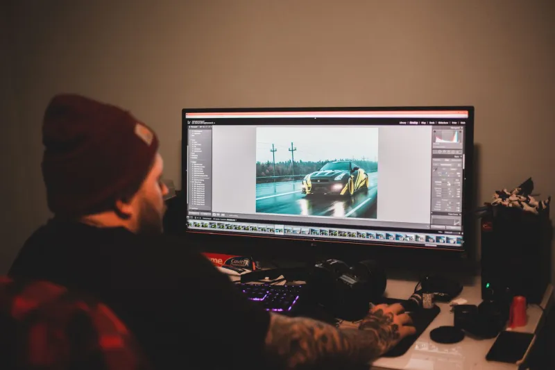
You approved the image. You saw it on the photographer's calibrated monitor, on your own laptop screen, perhaps even printed at full resolution on premium paper. It looked exactly right. The light fell where it was supposed to fall. The expression held exactly the quality you had worked to achieve. You uploaded it to LinkedIn, opened the app on your phone, and felt a quiet, inexplicable deflation. Something was different. The image was technically the same file, and yet it was not quite the same portrait.
This experience is not a failure of perception. It is a failure to account for the invisible technical infrastructure that stands between every professional portrait and its intended audience. At Portraits & Co., we work with clients whose images will live simultaneously across LinkedIn, Instagram, TikTok, and email signatures—and the technical requirements of those environments are not just different. In some respects, they are actively opposed.
Why Your Portrait Is Not One Image
When a portrait is captured by a professional camera, it exists initially as a raw file—a dense, uncompressed record of light data with a color depth and dynamic range that far exceeds what any screen can display. Everything that happens between that raw capture and the moment a viewer sees your face on their device involves a series of translations, each of which introduces the possibility of distortion.
The first translation is the export: the conversion from raw file to a deliverable format, typically JPEG or PNG. This step involves choices about color space, compression level, and sharpening that will determine how the image behaves downstream. A file exported for print is fundamentally different from a file exported for web, even if the visual differences are invisible at the export stage.
The second translation is the platform's own processing. Every major social and professional platform applies its own compression algorithm to uploaded images—a process designed to reduce file size and server load, not to preserve the nuances of professional portrait photography. These algorithms do not treat all visual information equally. They prioritize efficiency, which means they sacrifice precisely the kinds of subtle tonal gradations and fine detail that distinguish a professional portrait from a casual snapshot.
The LinkedIn Problem
LinkedIn compresses profile images aggressively, particularly on mobile. The platform's algorithm tends to introduce visible artifacts in areas of gradual tonal transition—exactly the kinds of gradations that appear in professional studio lighting on skin. Soft shadows become slightly posterized. The quality of light that a photographer spent considerable effort crafting is partially flattened.
The practical countermeasure is to export your LinkedIn portrait at a higher initial resolution than the platform's display size requires, with slightly elevated sharpening applied at the export stage. The platform's compression will reduce both resolution and sharpness, and a file that begins with excess of both will land closer to the intended result than one exported at minimum specifications.
LinkedIn also renders images in the sRGB color space. Any portrait delivered in Adobe RGB or Display P3 will undergo an automatic color space conversion that shifts certain colors—particularly in the warm tones common in professional portrait lighting—in ways that can make skin appear subtly less luminous. Exporting specifically in sRGB for LinkedIn is not a technical nicety. It is a prerequisite for accurate color.
Instagram's Compression Logic
Instagram's compression behavior differs from LinkedIn's in ways that reflect the platform's origins as a mobile-first, square-format application. The platform applies particularly aggressive compression to images uploaded at non-native aspect ratios, and its algorithm has historically been unkind to fine detail in hair and background texture—two elements that professional portrait photographers spend significant time perfecting.
For Instagram, the most reliable approach involves uploading at the platform's native resolution ceiling (currently 1080 pixels on the long edge) with a modest application of output sharpening calibrated for screen display rather than print. The goal is to give the compression algorithm as little work to do as possible, which means beginning with a file that already reflects the platform's preferred specifications rather than requiring conversion.
Stories and Reels introduce an additional variable: the vertical format compresses differently than the square or landscape formats used in feed posts, and the platform's playback rendering can introduce subtle motion artifacts even in still images used as backgrounds or title cards.
TikTok and the Video Frame Problem
For portrait photographers whose clients appear in video content—and in 2024, that is nearly every client—TikTok presents a distinct category of challenge. When a still portrait is used within a TikTok video (as a background, an introductory frame, or a thumbnail), it is subject not only to the platform's image compression but also to its video encoding, which operates on entirely different technical principles.
Video compression, unlike image compression, is temporal as well as spatial. It looks for redundancy not just within a single frame but across consecutive frames—and a still image used in video context can be treated by the encoder as a static element to be heavily compressed precisely because it does not change. The result is often a significant reduction in apparent image quality relative to the same image viewed as a standalone photograph.
Clients who anticipate using their portrait within video content should request a version of their image exported specifically for this use case, with sharpening and contrast calibration adjusted for the additional degradation that video encoding will introduce.
The Screen Calibration Variable
Beyond platform-specific compression, there is a variable that no photographer or client can fully control: the screen on which the image is ultimately viewed. Consumer displays vary enormously in their color accuracy, brightness calibration, and contrast rendering. A portrait that appears perfectly exposed on a calibrated professional monitor may appear slightly overexposed on a consumer laptop with an elevated brightness setting, or slightly cool on a display with a blue-shifted white point.
This is not a problem with a complete solution, but it has a practical implication: professional portraits should be edited to a target that anticipates the average consumer display rather than the ideal calibrated monitor. This typically means slightly more contrast and slightly warmer color temperature than might seem ideal on a professional screen—adjustments that compensate for the statistical reality of how most viewers will see the image.
What This Means for Your Session
The practical upshot of all this technical complexity is that platform-aware portrait photography is not simply a matter of taking a good photograph and uploading it. It requires a deliberate workflow that begins with platform-specific intentions at the time of shooting—choices about lighting contrast, color temperature, and background complexity that will behave differently across different compression environments—and continues through export, upload, and ongoing monitoring of how images appear across devices.
At Portraits & Co., every portrait delivery includes platform-specific file variants optimized for the environments where each client's image will live. Because looking like yourself should not depend on which app someone happens to be using when they find you.