Before You Book the Lens: How Your Wardrobe Palette Should Choose Your Photographer
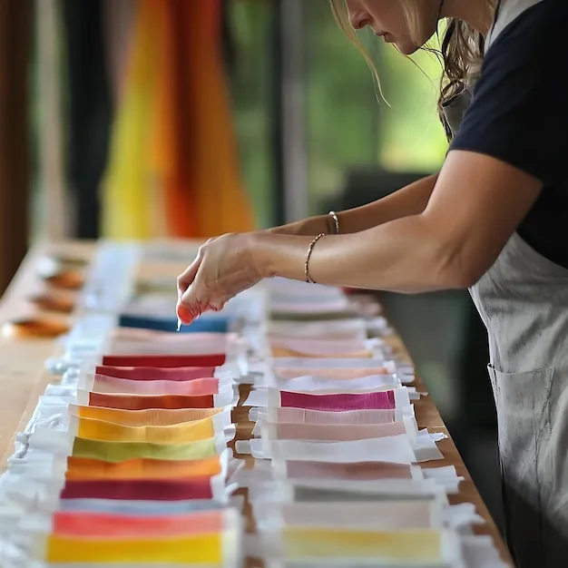
Photo: color analysis consultation fabric swatches skin tone studio, via img.freepik.com
The consultation room in Chicago's River North neighborhood looks more like a color laboratory than a styling studio. Swatches fan across a gray table in graduated rows — a spectrum of cool ivories, warm peaches, muted sages, and saturated teals. A client sits beneath a corrected daylight bulb, bare-faced, a white drape pulled over her shoulders, while an image consultant holds fabric after fabric up to her jawline and watches what happens to her skin.
"There," the consultant says, dropping a slate-gray swatch and replacing it with a deep forest green. "Watch your eyes. The gray makes you recede. The green makes you arrive."
This is a professional color analysis — a service with roots in mid-century theatrical design that has enjoyed a quiet American resurgence, driven in part by professionals who realize their visual identity is now distributed, searchable, and permanent. But here is the part almost nobody considers: the palette that consultation produces shouldn't just reshape your closet. It should determine which photographer you hire, in what kind of studio, with what lighting plan.
Color Is a Technical Specification, Not a Preference
Ask three working photographers about client palettes and you will get three very different answers — which is precisely the point.
Marisol Vega, a portrait photographer in Austin whose studio leans heavily on natural window light, puts it bluntly: "If someone walks in wearing colors that fight their skin tone, I can spend forty minutes in retouch trying to fix what a different shirt would have fixed in two seconds." Vega estimates that warm-toned clients photograph better in her south-facing studio, where afternoon light runs amber through sheer curtains. Cool-toned clients, she says, often look washed out in the same setup — so she schedules them for morning sessions or moves them to her neutral gray wall with controlled strobes.
In Minneapolis, commercial photographer Dean Okafor runs the opposite operation: a fully controlled studio with tunable LED panels. "I can dial color temperature anywhere from 3200 to 5600 Kelvin," he explains. "That's not a luxury. That's how I make sure the client's palette and my lighting are having a conversation instead of an argument." Okafor asks every client for their color analysis results — or, failing that, photographs them in three swatch drapes before committing to a lighting plan. "A jewel-toned wardrobe under warm tungsten light turns muddy. A muted autumn palette under cool blue LEDs looks sickly. These are physics problems, not taste problems."
The third photographer, Washington, D.C.-based editorial shooter Claire Bunting, thinks about color environmentally rather than technically. "Government and legal clients here tend toward deep, saturated tones — navy, burgundy, forest," she says. "Those palettes demand depth from a background. Put a client in rich sapphire against a pale gray seamless and the whole frame goes flat. I build the set around the wardrobe, not the other way around."
The Audit That Should Precede the Booking
What these three practitioners share is a conviction that image curation begins long before a camera is booked. Their advice converges on a practical sequence:
First, know your palette. A professional color analysis — typically $150 to $400 in most US metros — identifies whether your skin's undertones favor warm, cool, or neutral hues, and whether you're flattered by high saturation or muted softness.
Second, interrogate your photographer's setup. Ask what color temperature they shoot at, what backdrops they keep on hand, and whether they've worked with your palette family before. A photographer who cannot articulate how light interacts with wardrobe color is a photographer who will leave your look to chance.
Third, align session style with palette temperament. High-contrast palettes — the kind that thrive under crisp, directional studio light — pair naturally with formal portraiture. Low-contrast, earthy palettes often sing in environmental sessions with warm, ambient light. Matching the wrong session style to your palette is like pairing a bold Cabernet with a delicate salad: nothing technically fails, and everything quietly disappoints.
Curation Starts in the Closet
The writer who sat in that River North consultation left with a swatch book and, two weeks later, a new photographer. Her previous headshots — taken in a bright, cool-toned coworking space, wearing a color her consultant identified as actively wrong for her — have been retired. The new portraits, shot against deep charcoal seamless with controlled lighting tuned to her palette, present a person who looks, in her own words, "like I got eight hours of sleep and a raise."
Nothing about her face changed. What changed was the coordination between the colors she wore and the person holding the camera. That coordination is not an accident of good photography. It is the first, cheapest, and most neglected instrument of professional image curation — and it belongs in your hands before the deposit ever changes hands.