Cover Art at Conversation Scale: Portraiture for the Audio-First Brand
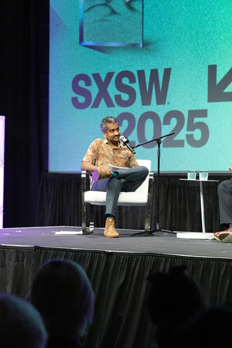
Photo: Bea Phi, CC BY-SA 4.0, via Wikimedia Commons
Audio-first brands have a visual problem. The work itself may be intimate, conversational, and long-form, but the first encounter is often a thumbnail. A listener scrolling through a podcast app or a newsletter archive sees a face at a scale that removes nuance. The portrait must communicate before the first sentence is heard. For hosts, interviewers, and audio creators, that makes the cover image a strategic asset rather than a decorative one.
At Portraits & Co., we treat the audio cover portrait as a distinct genre. It is not a corporate headshot, and it is not a performance photograph. It is a compressed visual signature. In 2026, with audio brands multiplying across platforms, the cover image has to do three things at once: identify the person, establish the tone of the show, and survive the platform's cropping and compression.
The Thumbnail Is the New Front Door
Most audio discovery happens in a list. The cover image appears beside a title, a category, and perhaps a short description. The viewer is not studying the image; they are scanning it. This means the portrait must read at the smallest size first. Details that matter in a full-screen photograph, such as a subtle lapel pin or a faint expression in the eyes, may vanish entirely. The composition must rely on shape, contrast, and posture.
The common mistake is to design for the full-size artwork and assume the thumbnail will take care of itself. It rarely does. A portrait that looks elegant at 3000 pixels can become a dark rectangle at 100 pixels. A face that is too small in the frame can disappear. A background that is too busy can turn into visual noise. The cover portrait must be built from the thumbnail outward.
The Seven-Point Cover-Portrait Checklist
-
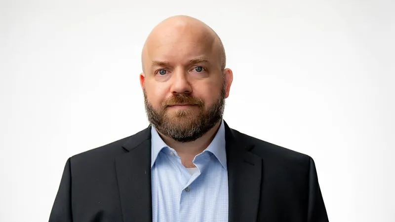
Compose for the smallest size. Start with the crop, not the full frame. The head and shoulders should occupy enough of the image that the face remains legible when the artwork is reduced. A general guide is to keep the face at roughly one-third to one-half of the image height, depending on the platform's crop. Avoid wide environmental portraits for the primary cover unless the environment is essential to the brand and still readable at small scale.
-
Keep the face at conversational scale. Audio is intimate, and the portrait should feel like a person speaking to one listener rather than a performer addressing a room. That usually means a direct or slightly angled gaze, a relaxed jaw, and a head position that does not feel theatrical. The face should be close enough to invite attention but not so close that the crop feels aggressive.
-
Choose an expression that survives compression. Subtle expressions often flatten in small images. A slight smile may read as neutral; a neutral expression may read as severe. The goal is not a broad grin but a clear emotional signal. Test the expression at thumbnail size. If the face reads as warm, curious, or authoritative without ambiguity, it is likely working.
-
Use wardrobe as a signal, not a costume. A microphone prop is not necessary and often looks like a visual cliché. Wardrobe can do more. A textured knit, a crisp shirt, a dark jacket, or a colored layer can signal the tone of the show without literal props. The key is contrast: the clothing should separate from the background and frame the face. Avoid busy patterns that break up at small sizes.
-
Light for separation, not drama. The cover portrait needs a clear edge between the subject and the background. A simple key light with a subtle rim or fill is usually enough. Heavy shadows can create mood, but they can also turn the face into a dark mass on a phone screen. The lighting should preserve the eyes and the shape of the head. If the show has a dramatic brand, the drama can come from color and composition rather than from underexposure.
-
Leave room for platform furniture. Cover art is rarely displayed alone. Platforms may overlay icons, episode counts, or category labels. The portrait should have enough negative space around the head and shoulders to survive those overlays. A centered composition with breathing room is generally safer than a tightly cropped face that leaves no margin.
-
Build a series, not a single image. Audio brands release episodes, seasons, and special series. A cover portrait should be part of a visual system: the same lighting, the same wardrobe palette, and the same crop logic. A single image can work for a launch, but a series signals consistency. If the show has guest hosts or co-hosts, the system should accommodate multiple faces without losing coherence.
Why the Microphone Prop Usually Fails
A microphone in the frame is the fastest way to say podcast, but it is not the most effective way. At thumbnail size, a microphone can look like a dark object near the face. It can obscure the jaw, compete with the eyes, and make the portrait feel like a promotional image rather than a portrait. More importantly, it substitutes a prop for a signal. The listener already knows the format from the platform. The cover image should communicate who the person is and why the conversation is worth hearing.
There are exceptions. A microphone can work if it is part of the host's established visual identity or if the show is built around live performance or interviews in a specific setting. But even then, the microphone should be subordinate to the face. The portrait should not depend on the prop to be legible.
A Note for Interview-Based Shows
Interview-based shows have a particular challenge: the host must be recognizable, but the show is not only about the host. The cover portrait should establish the host as a guide rather than a solo performer. A slightly angled body, an open posture, and a warm but attentive expression can suggest conversation without showing a guest. If the show uses guest portraits, the host image should be distinct enough to anchor the brand while leaving room for variation.
For US creators, the practical context matters. Podcast discovery often happens on mobile devices, and the cover image may appear alongside major network shows with large design budgets. A clean, well-lit portrait with strong contrast and a clear face is more competitive than a complex composite. Simplicity is not a lack of ambition; it is a recognition of the viewing conditions.
The Final Test
The best test for an audio cover portrait is to shrink it. View it on a phone at the size it will actually appear. Ask three questions. Can I identify the person? Can I sense the tone of the show? Would I click this image to hear a conversation? If the answer to all three is yes, the portrait is doing its job. If not, the problem is usually scale, contrast, or expression, not a missing microphone.
Audio-first brands need visual discipline because their medium is invisible. The cover portrait is the face of the voice. It should be designed for the conversation, not for the full-size file.